

The Goldilocks Atlas: Mapping the Worlds Next Door
There’s a moment, on any clear night, when the yard work is done and the house has gone quiet, that I find myself just standing there — head back, porch light off — looking up. It never gets old. Every one of those points of light is a sun. And around more of them than we ever dared to guess, there are worlds. Not metaphorical worlds. Cataloged ones, with names and masses and orbital periods, discovered by people who spent years teasing a planet’s shadow out of a flicker of starlight. Some of those worlds sit in what astronomers call the Goldilocks zone — not too hot, not too cold, where liquid water could pool on a rocky surface. Just right. I wanted to see them. Not in a spreadsheet — see them. Where they actually are, hanging in the dark around us. So I built a map. Start with the real sky The Goldilocks Atlas is an interactive 3D chart of 115 potentially habitable exoplanets, and everything in it is real. The data comes straight from the NASA Exoplanet Archive — the same catalog professional astronomers use — filtered down to rocky-sized worlds (no gas giants allowed) that receive roughly the same amount of starlight Earth does. Every planet sits at its true position in the sky. I took each world’s celestial coordinates and distance and placed it in 3D space with Earth at the center, surrounded by distance rings marking 10, 50, 200, 1,000, and 5,000 light-years. Because the distances involved are so absurd — our nearest neighbor is 4 light-years away, the farthest world on the map is thousands — the map uses a logarithmic scale, the same trick your ears use to hear both a whisper and a jet engine. And here’s my favorite part: the real sky has structure, and the map shows it. Drag the view around and you’ll notice a dense cluster of worlds crowding one corner of the heavens. That’s not a bug. That’s the Kepler field — the single patch of sky NASA’s Kepler telescope stared at, unblinking, for nine years. The map accidentally became a portrait of how we search. The neighbors keep arriving The best reason to build this now: the list keeps growing. Nineteen of the 115 worlds on the map were discovered in just the last three years — including a few announced in 2026 that are practically next door. GJ 887 d is 10.7 light-years away. Proxima Centauri d orbits the closest star to our Sun — no world we ever find will be nearer. Click any world and a dossier slides open: its size, its mass, the length of its year, how much starlight falls on it, and an Earth Similarity Index — a rough score for how much it resembles home. The current champion, Teegarden’s Star b, scores 0.98 out of 1.00. It’s twelve and a half light-years away. On a cosmic map, that’s across the street. Each dossier also includes a portrait — generated on the fly from the planet’s actual temperature. Cold worlds render icy and blue, temperate ones green, warm ones amber, each lit by the color of its actual star. Nobody has ever photographed these planets; the portraits are honest guesses, painted by physics. How it was made Here’s the part that still amazes me as a designer: the entire site is one HTML file. No frameworks, no plugins, no database calls. The 3D engine is written from scratch in plain JavaScript on a single canvas element — projection math, camera controls, the glowing star sprites, all of it. The planet data is baked right into the page, so it loads instantly and works forever, even offline. I built it in an afternoon, working with Claude (Anthropic’s AI) as a collaborator — pulling fresh data from NASA’s archive, checking the astronomy, and iterating on the design until the thing on screen matched the feeling of standing in the yard at night. Go look up Explore the Goldilocks Atlas here. Drag to orbit. Scroll to zoom. Click a world and read its story. Filter down to just the planets found since 2024 and marvel at how fast the neighborhood is filling in. Then, tonight, if it’s clear — go outside and look up. Somewhere in that dark, 115 worlds are looking back. Statistically speaking, a few of them might even have someone doing the looking. — Dan, DGS Designs

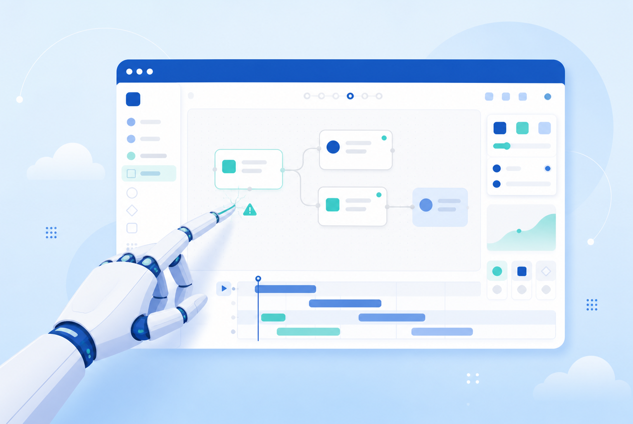
AI Didn’t Just Build a Soulless Course. It Broke My Storyline File.
A viral LinkedIn post says AI-built courses feel cold. True, but it’s not the risk I’d lead with — letting an AI agent drive your authoring tool directly can wreck your project file, and that’s exactly what happened to mine.

How to Write a Branching Scenario That Doesn’t Feel Fake
Most branching scenarios feel fake because they were never planned before they were built. Here’s how to story-map a scenario like a mind map before you touch Storyline, and why that shape matters.
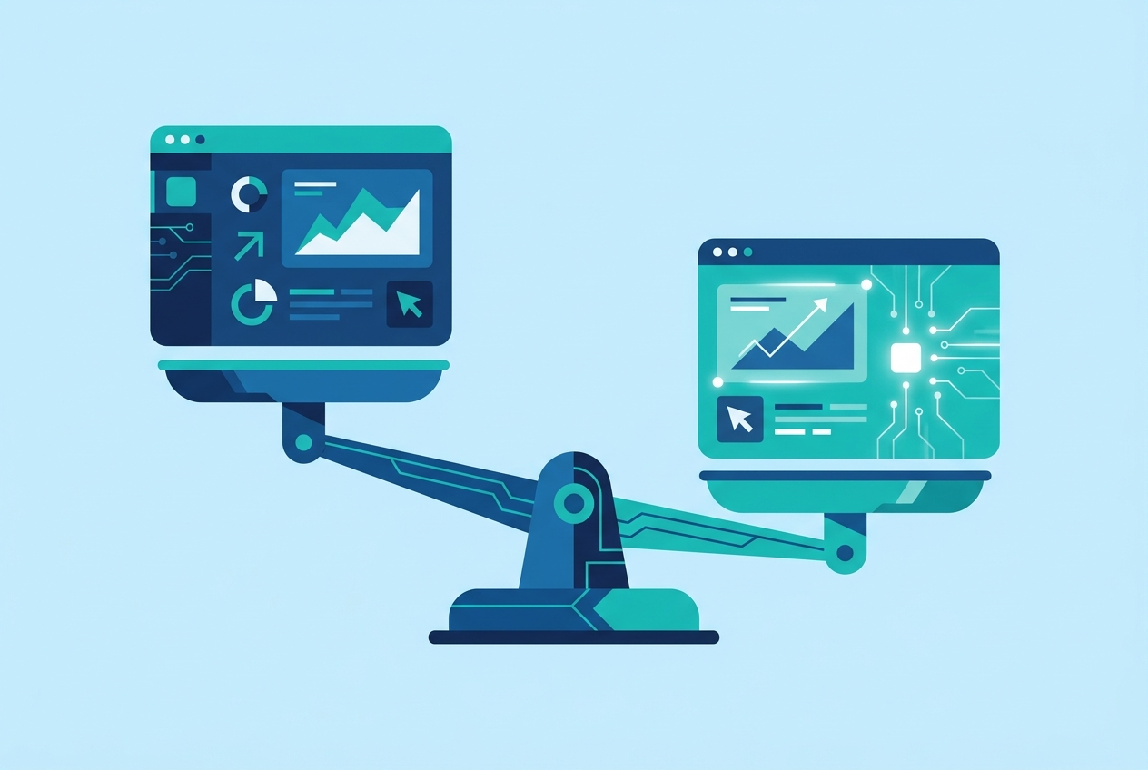
Storyline vs. Captivate in 2026: Which Should You Actually Use
Storyline and Captivate used to be a genuinely close call. After Captivate’s engine rebuild, I don’t think it is anymore — here’s an honest, opinionated buyer’s guide from 22 years of using both.

Outsourcing the Thinking: The Real Risk of Letting AI Design Your Training
AI can draft a course in minutes, but the judgment that makes training actually work — knowing your learners, picking the scenario that will land, spotting where a wrong answer needs to feel wrong — is not a speed problem. It is a design skill that atrophies the moment you stop exercising it.
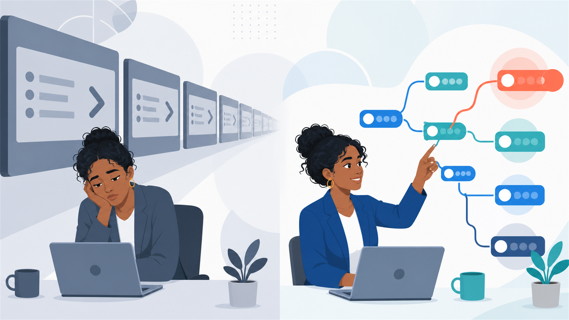
Death by Next Button: Why Nobody Remembers Your Compliance Training
Think about the last mandatory training course you took. Harassment prevention, cybersecurity awareness, safety procedures — doesn’t matter which. Now try to remember three specific things it taught you. If you’re like most people, you can’t. But I’d bet you remember the button you clicked to get through it: Next. That’s not a you problem. That’s a design problem — and after 22 years of building training for federal agencies and Fortune 500 companies, I can tell you it’s the most expensive open secret in the eLearning industry. What click-next training looks like You’ve seen it. A slide of bullet points. A voiceover reading the slide to you. A Next button. Another slide. Another Next. Forty minutes later, a five-question quiz you can pass without having paid attention, a completion certificate, and a records system that says you’re “trained.” The organization got a checkbox. The learner got nothing. And somewhere, real training budget was spent turning a PowerPoint deck into a slightly fancier PowerPoint deck with a play button. How it gets built Nobody sets out to build forgettable training. It happens for predictable reasons: The brief was a content dump. A subject matter expert hands over a 60-slide deck and the instruction is “make this into eLearning.” The deck gets converted faithfully — same slides, same order, same wall of text — because on a tight timeline, faithful conversion is the path of least resistance. Completion is the only metric. When success is defined as “everyone finishes by Q4,” the fastest path to success is a course nobody can fail. Friction gets engineered out — and friction is where learning happens. Interactivity got confused with decoration. A tabbed interface, a flip-card, a drag-and-drop matching game. These look interactive, but they’re navigation, not decisions. Clicking a tab to reveal text is just a fancier Next button. Why it matters more than you think For most training, click-next is merely wasted money. For compliance training, it’s worse — it’s compliance theater. The point of harassment training isn’t the certificate; it’s that a manager recognizes the situation in front of them and handles it correctly. The point of safety training is behavior under pressure. When training produces completions instead of competence, the organization has purchased legal paperwork while the actual risk — the thing the training exists to reduce — is untouched. And learners aren’t fooled. Every eye-rolling, speed-clicking employee is learning one real lesson from click-next training: this organization doesn’t take this topic seriously, and neither should you. What the alternative looks like The fix isn’t more animation or a mascot. It’s replacing information delivery with decision practice: Scenarios instead of definitions. Don’t define quid pro quo harassment on a slide — put the learner in a conversation where a manager hints a promotion depends on a date, and make them choose a response. Branching with consequences. Wrong choices shouldn’t produce a red X and a “try again.” They should play out — the complaint doesn’t get filed, the situation escalates — so the learner feels why the right answer is right. Realistic failure. A course you can’t fail is a course you can’t learn from. Knowledge checks should require the judgment the job actually demands, not recall of a bullet point from two slides ago. Shorter, sharper, spaced. One 40-minute annual course loses to four 10-minute scenario sets spread across the year — same seat time, radically different retention. This is exactly what tools like Storyline are actually for — branching scenarios, variables, adaptive paths. Using them to rebuild a PowerPoint is like buying a flight simulator to watch a slideshow about airplanes. “But that costs more” Somewhat — good design takes design time. But the gap is smaller than most buyers assume (our PowerPoint conversion pricing guide breaks down real numbers), and AI-assisted production has shrunk it further: AI narration alone removes weeks of re-recording logistics from scenario-heavy courses, where scripts change constantly during review. The real comparison isn’t cheap course vs. expensive course. It’s money that bought a checkbox vs. money that bought changed behavior. One of those is 100% waste at any price. None of this requires sacrificing compliance requirements, either — scenario-based courses can and should still meet Section 508 accessibility standards; accessibility and engagement reward the same thing: intentionality. The one question that reveals everything If you’re buying training this year, ask one question during your next project conversation: “Show me a course where the learner can make a wrong decision and see what happens.” If the answer is all tabs, timelines, and Next buttons, you’re looking at a checkbox. If they light up and start showing you branching scenarios — that’s a team that builds training people remember. At DGS Designs, we’ve spent two decades turning content dumps into decision practice for federal agencies and enterprise clients. Contact us if your training deserves better than a Next button.